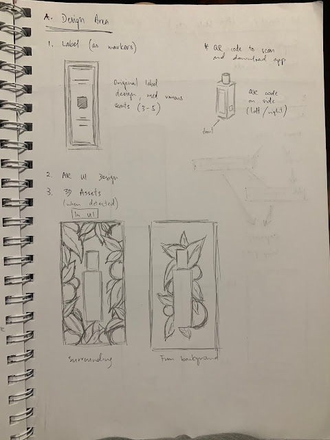
Marker/Icon Design
After the submission for Assignment 1 on week 6, I further moved on with the marker design, which was surprisingly more challenging than I had thought. Especially after the sharing by Chia Yeh, I had to put a lot of things into consideration when designing the marker icons so I can ensure that they are not only easy to scan but also recognizable at first glance.


I have chose to do at least 3 different markers for 3 different scents, which I fortunately have at home. While my sister has Lime Basil and Mandarin, English Pear and Freesia, and Wood Sage and Sea Salt, I personally own English Oak and Hazelnut, and Earl Grey and Cucumber. With these existing bottles, I can easier measure the size required for the markers and roughly have an idea of where to place them.
The design process first started with rough sketches on paper, with the initial idea of using minimalist and line art style to match Jo Malone's elegant image. The size also has to be small in order to fit their 30ml bottle size, which will approximately be 2cm x 2cm.

The image above shows the rough initial sketches of what I had in mind, according to the different colognes mentioned above (including Wild Bluebell, which happens to be my mistake because I thought... I thought we had that. It's only until I was 70% done with wild bluebell icon on Illustrator then I remembered that... actually we do NOT have that. Please insert clown emoji.)
Following next, I moved on to doing the design on Adobe Illustrator. I was facing quite some hard time trying to design because it didn't look elegant enough to me. References are the best at times like this, innit?
These are mainly the images that gave me inspirations throughout the design process.

This is how my working file currently looks like, the artboards on top left and right consists of mostly first stage designs, especially the wild bluebell and mandarin orange with basil leaf, they didn't look elegant to me, not portraying the ~vibe~ I wanted. So I tried to refine them, starting with the easier ones first. The artboard on the bottom left doesn't look too different, but the two icons at the most bottom which are english pear and freesia, as well as the english oak leaf with hazelnut are the refined designs and I am pretty much satisfied with these two as of now. I'll continue to work on at least another one to two more designs, collect some feedback especially from graphic design students (since they do this more often than us), and further refine if needed. If all goes well, I expect to have them printed by this week or latest next Tuesday because... it is the only day I'm free in the morning.
Personally I am also feeling the pressure as I am aware that my progress is pretty slow, so I'm really determined to speed up my working pace. I plan to start working on the 3D assets in C4D this week, hopefully to quickly catch up so avoid any last minute ...tragedy.

Comments
Post a Comment