Sketches/Planning
After the consultation, I will now need to organise my remaining tasks for better execution.
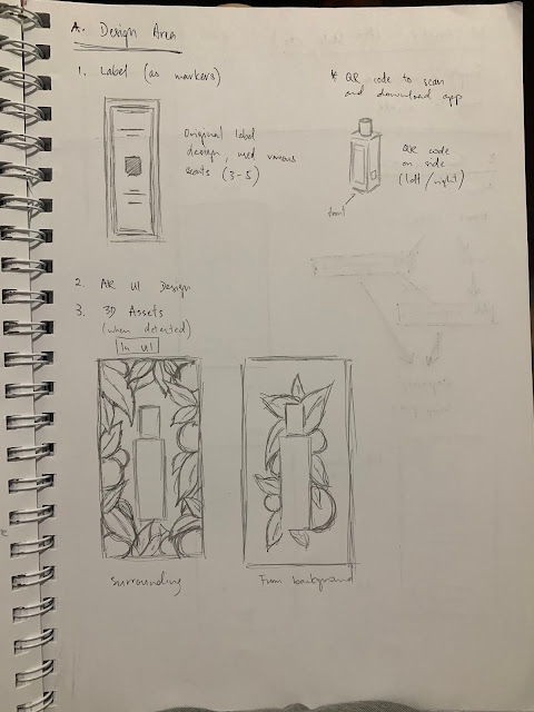
First off is the marker design, instead of designing a new icon or marker, it is recommended to use the original label. A QR code will be needed to download the app so in terms of label and marker, I only need to use the original ones and generate a QR code later.
Next is the 3D assets. I have two choices in terms of UI, one is the florals surrounding the bottle when detected, and another one is from the back of the bottle. Experiment will be needed to decide which is better.
As of the art style for the 3D objects, it's recommended that I do something simple and not too complicated. There's no need for it to be too complicated so it's less time consuming. I can also play around with the lighting and composition to further enhance it without having to do anything to realistic for the 3D objects.
Next is the communication part, including the pages and flow of the app. I have decided on Home, Info, AR experience pages and the capture/snap photo feature.
-----------
Mobile app UI references
I'm looking at some references of mobile app UI design. Although there are very minimal UI elements for the app but it's still necessary to make it look as good as possible.
Below are references for layout which I plan to make it simple.


Comments
Post a Comment