Posts

Final Artefact

Image
After much challenges, I have finally completed building the AR application on Unity. Not only Vuforia and Unity, I also had to install Android Studio, JDK and JRE for app building. Once the APK is built and saved in my laptop, I connected the Samsung S6 Edge Plus with my laptop and imported the APK into the phone. Next, I installed the APK in the phone. This is how the icon of the application looks like. It's the logo of Jo Malone that can be found on their packaging as well. This is the homepage of my app. User can be seen holding the device and the bottle of cologne that will be scanned. This is the instruction page of the app. The user is shown scanning the image target with the application and the 3D models of lime basil and mandarins showed on screen. The application did achieve the most basic expectation I had in mind, although it is not very fancy or full of content, I had at least learnt how to build an AR app and gained more technical knowledge. One thing regrettable is t

Reflection, Realisation and Problems

First off, this project itself is a very new experience to me because I had no experience with AR app making; Unity or Vuforia; I am bad at 3D modelling. But still I had to push through this with all my might. I genuinely think I could have done better in terms of UI design and 3D modelling. The aesthetic is just not there and it's really a shame.  I'm constantly in a fight with myself, sometimes thinking that the fact that I tried my best is already good enough. But then again I'm very ashamed that I couldn't do better. The lack of time was a problem but if I were to be honest, it was more on me and my own issues. On a personal level, not only that my skills are not good enough, I'm also distressed by how my emotional and mental state heavily affected my performance. This semester is possibly the worst one I have experienced. I was feeling utterly demotivated for almost the entire semester and it got even worse as the deadline approached. To be honest, I did not ha

Progress 2.0: Unity

Image
Once I was done with the UI and 3D asset, I moved on to setting up the app using Unity and Vuforia. It's my first time using Unity, I had to learn and understand everything from scratch, which was really, really, challenging. First page of the app, which is the homepage.  This is the instruction page. You can't really see it clearly but this is the image target and 3d asset.       And here is the game testing using the laptop camera. At first I faced a lot of problems with the asset and image target because their positions always came off weird and off when I tested with the camera. It's only later I realised I had to put the asset as a child of the target, then it worked. Position, sizing and all that jazz. It's all because I didn't put the asset in the right place.  I had to learn about setting up the canvas and making the UI from my classmate Xiao Tung who is also doing AR app. I really couldn't find anything or rather I didn't know HOW to find, using wha

Progress

Image
Here's a confession: this is a very very very late update and I'm updating everything at once. Further information in probably my last blog post. But first I'll carry on with the progress. After sketching and planning, I moved onto designing the UI of the app. I couldn't do much due to the time constraint but I still tried my best to do as much as I could.  I first started off designing with an iPhone XR's viewport because I own an XR, right? Its the towards the last few days I realised that I couldn't use Xcode on my laptop that runs on Windows. Which means I can't download the app with my own phone. Which means I need an Android phone. Which again means I need to change the viewport, which I did. The design remained pretty much the same but just in different size.  Regarding the design, I chose this pale yellow because again this is for the brand, Jo Malone. This yellow is used on the labels, packaging as well as their websites. So I decided to stick to th

Sketches/Planning

Image
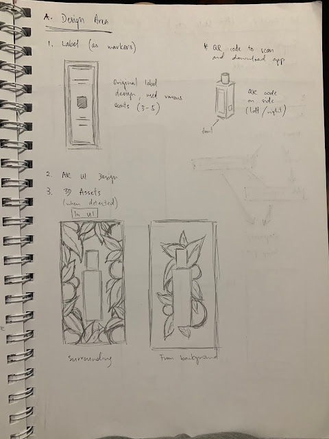
After the consultation, I will now need to organise my remaining tasks for better execution.  First off is the marker design, instead of designing a new icon or marker, it is recommended to use the original label. A QR code will be needed to download the app so in terms of label and marker, I only need to use the original ones and generate a QR code later. Next is the 3D assets. I have two choices in terms of UI, one is the florals surrounding the bottle when detected, and another one is from the back of the bottle. Experiment will be needed to decide which is better. As of the art style for the 3D objects, it's recommended that I do something simple and not too complicated. There's no need for it to be too complicated so it's less time consuming. I can also play around with the lighting and composition to further enhance it without having to do anything to realistic for the 3D objects. Next is the communication part, including the pages and flow of the app. I have decided

Marker/Icon Design

Image
After the submission for Assignment 1 on week 6, I further moved on with the marker design, which was surprisingly more challenging than I had thought. Especially after the sharing by Chia Yeh, I had to put a lot of things into consideration when designing the marker icons so I can ensure that they are not only easy to scan but also recognizable at first glance. I have chose to do at least 3 different markers for 3 different scents, which I fortunately have at home. While my sister has Lime Basil and Mandarin , English Pear and Freesia , and Wood Sage and Sea Salt, I personally own English Oak and Hazelnut , and Earl Grey and Cucumber. With these existing bottles, I can easier measure the size required for the markers and roughly have an idea of where to place them. The design process first started with rough sketches on paper, with the initial idea of using minimalist and line art style to match Jo Malone's elegant image. The size also has to be small in order to fit their 30ml bo

Week 5: Refining Proposal

Image
After the consultation on week 4, I had to refine my proposal alongside the learning plan and project management chart which is due next week. Louise showed us examples of how to write project background, purpose and all that jazz after week 4's consultations. They were pretty helpful so I actually managed to refine and write them accordingly. I also had to plan out my user flow, a sketch of what is going to happen when the users engage with the AR app. Louise also showed me another case study on AR by Shazam and the gin brand, Bombay Sapphire. (Not gonna lie I felt so weird seeing the gin on screen because we have one laying at home for YEARS) To summaries, users can scan the complimentary little tag that comes with the bottle, then they will see animation of flowers coming out of the label, also users will have access to the videos of different cocktail recipes utilizing this gorgeous looking liquor while different genres of music will play according to the different recipes. (Al